Brand guidelines
How to represent Precip in press, partnerships, integrations, and anywhere else our name, logo, or data appear.
Thanks for featuring Precip. The assets and guidelines on this page are here to help you use our brand correctly. If you need something not covered here, contact us and we'll be happy to help.
Logo
The Precip logo is a set of three falling rain drops, angled the way rain actually falls, paired with our wordmark.




- Preferred: the blue logo (
#155EEF) on white or light backgrounds. - On dark backgrounds: use the white logo. Use the black logo only when printing in one color.
- Clear space: keep padding around the logo of at least the height of the "P" in the wordmark on all sides.
- Minimum size: don't render the horizontal lockup smaller than 36px tall — a 19px cap height (or 0.25in in print). Below that, use the mark alone.
- Avatars: use the supplied avatar file as-is — white mark on Precip Blue. Don't recreate it or change the mark-to-canvas ratio.
Downloads
- Lockup — blue (SVG)
- Lockup — black (SVG)
- Lockup — white (SVG)
- Mark only — blue (SVG)
- Mark only — black (SVG)
- Mark only — white (SVG)
- Horizontal — blue (PNG)
- Horizontal — black (PNG)
- Horizontal — white (PNG)
- Vertical — blue (PNG)
- Vertical — black (PNG)
- Vertical — white (PNG)
- Social avatar (SVG)
- Social avatar (PNG, 2048px)










Please don't
- Recolor, distort, rotate, outline, or add effects to the logo.
- Place the blue logo on busy or low-contrast backgrounds.
- Rearrange the mark and wordmark, or set the wordmark in a different typeface.
- Use our logo in a way that implies endorsement or partnership without a written agreement.
Our name
Our product is Precip one word, capital P. You may also refer to it as "The Precip app". Never refer to it as "Precip.ai", or "Precip AI". In running text, write it like any proper noun: "Track rainfall with Precip." The legal entity behind the product is Precipitation Inc., which should only appear in legal contexts.
Naming
- Precip
- The product and the brand. Use alone wherever possible: “available in Precip,” “Precip shows…”
- Precip API
- The developer product. “Precip API” on first mention, “the API” after.
- precip.ai
- The domain. Lowercase, only as a URL — never as the product name in prose.
- Precipitation Inc.
- The legal entity. Legal and financial contexts only.
- Feature names
- Sentence case, descriptive, no coined trademarks: rain history, threshold alerts, explore mode. Features are lowercase in running text.
Color
Precip is blue. A focused palette of blues carries the brand, with calm neutrals and one exact color per precipitation type.
Primary
Neutrals
Precipitation colors
Each precipitation type has one hue, everywhere it appears — maps, badges, charts, and legends. These are the full-intensity values; on maps they fade in from transparent at zero. When two types fall in the same period, badges stripe the two colors diagonally rather than blending them.
Map badges at full intensity — mixed precipitation stripes the two types.
Typography
Two typefaces do almost all of the work.
Headlines and display text in marketing material. Available from Fontshare.
Body copy and product UI. Regular (400) for text, Semibold (600) and Bold (700) for emphasis. Available from Google Fonts.
When our fonts aren't available (e.g. in email or documents), fall back to the platform's system sans-serif rather than substituting another typeface.
The product in use
When you need to show Precip, show the real thing actual screenshots with exciting data.

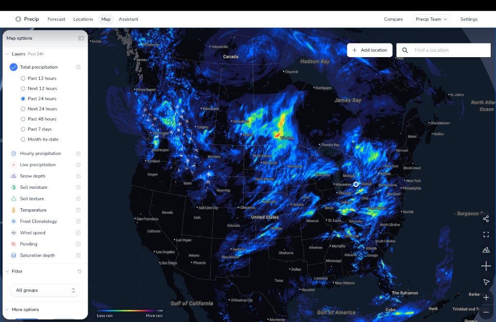
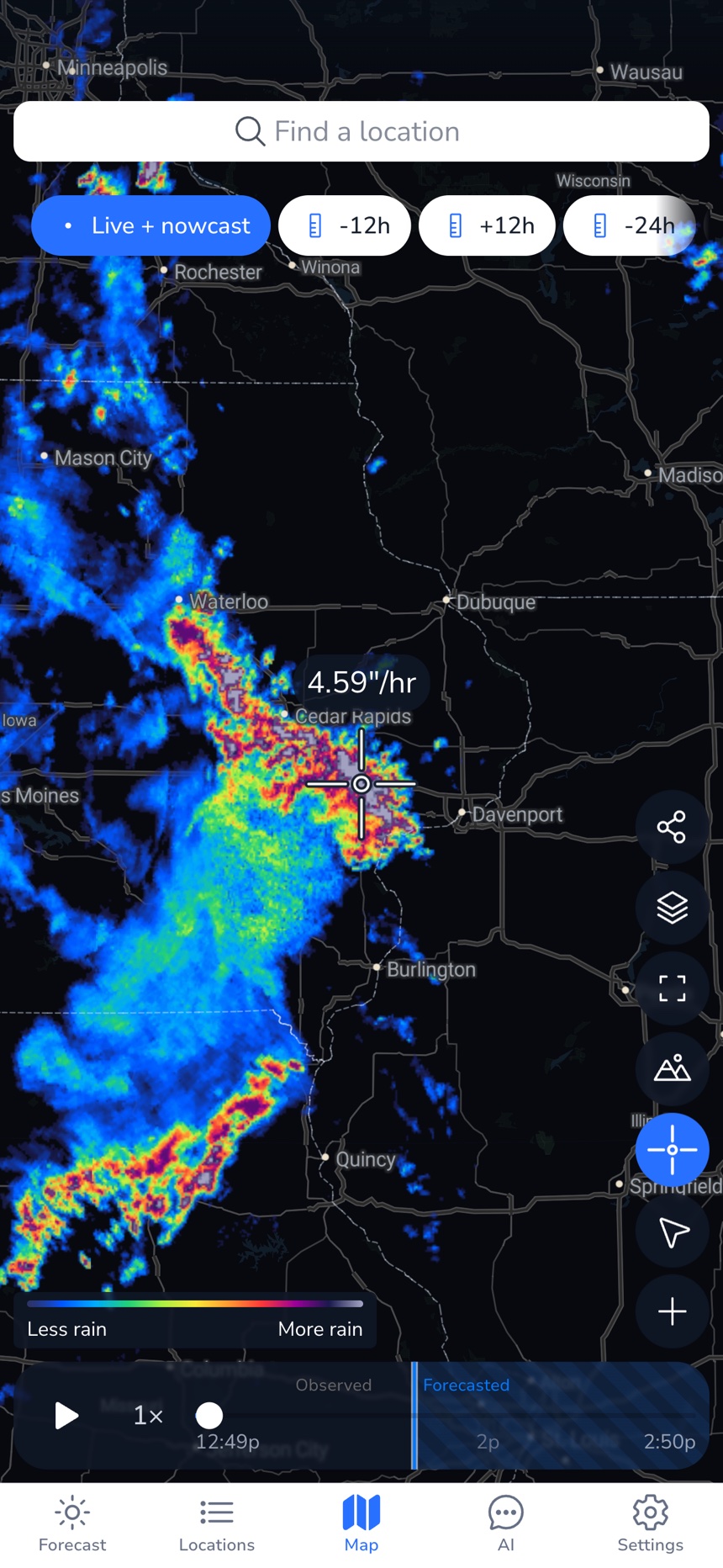
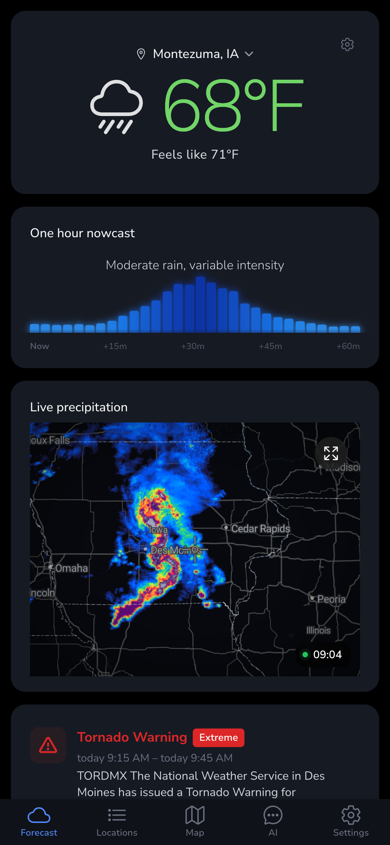

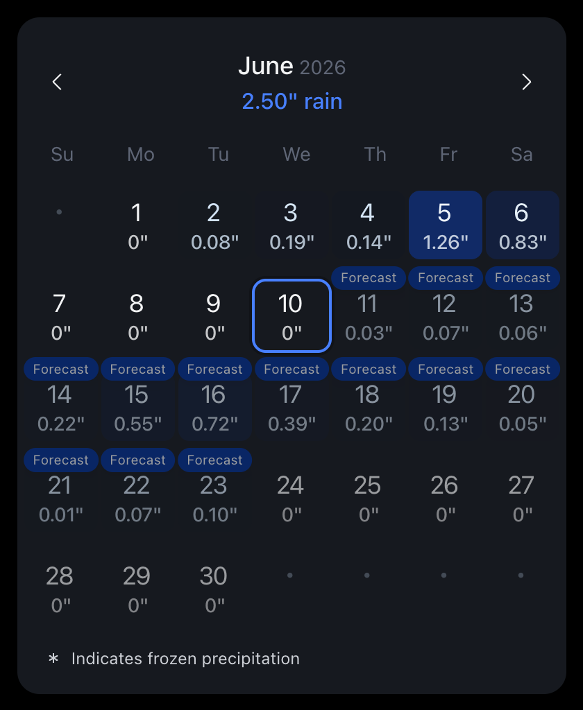
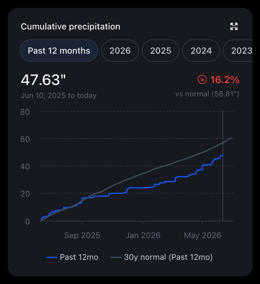
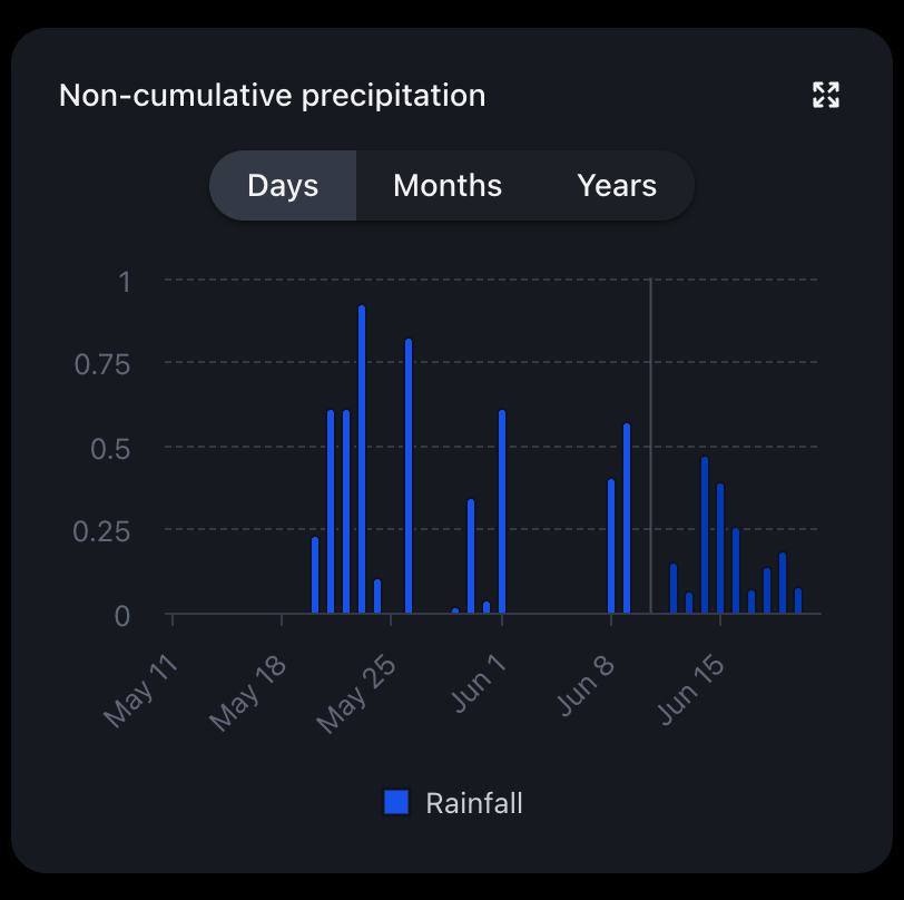


- Use real screenshots when possible. Capture them yourself or use the examples above.
- Show exciting data. Pick a location and date range with weather worth talking about. Don't show boring charts or numbers that don't tell a story.
- Don't crop out attribution. The Precip logo and "Powered by" marks stay in frame.
- Need something specific? Live, embeddable versions of these widgets are available for any location. ask us about embeds and the API.
Attribution
If you display, embed, or republish Precip data, say so with our attribution badge or a written credit.


- In products and integrations: place the "Powered by Precip"
badge near the data it describes, linked to
https://precip.ai. Don't render it smaller than 20px tall. - In articles, reports, and broadcasts: a written credit is fine. Use "Data: Precip (precip.ai)" or "Source: Precip" in the caption or footnote of any chart, map, or figure built on our data.
- In screenshots: screenshots of the Precip app or embeds may be published as-is. Don't crop out the Precip logo or watermarks.
- Don't alter the badge, set it in another typeface, or use it to imply that Precip endorses your product. It states the data source, nothing more.
Downloads
Social cards
Share cards follow one layout: logo, one big statement, context line.
- Background: Midnight (
#101319) with a subtle blue glow. White logo, top left, 54px tall. - One statement per card, set in General Sans Medium. The
key number is Sky Blue (
#528BFF); everything else is Mist (#F4F5F6). - Context line at the bottom: location · region · precip.ai, in Nunito Sans.
- A small data motif (bars, a scale) may sit bottom-right — decoration stays under 15% of the canvas.
Download the HTML template to produce cards that match exactly.
Photography
Real land, real weather, real stakes.
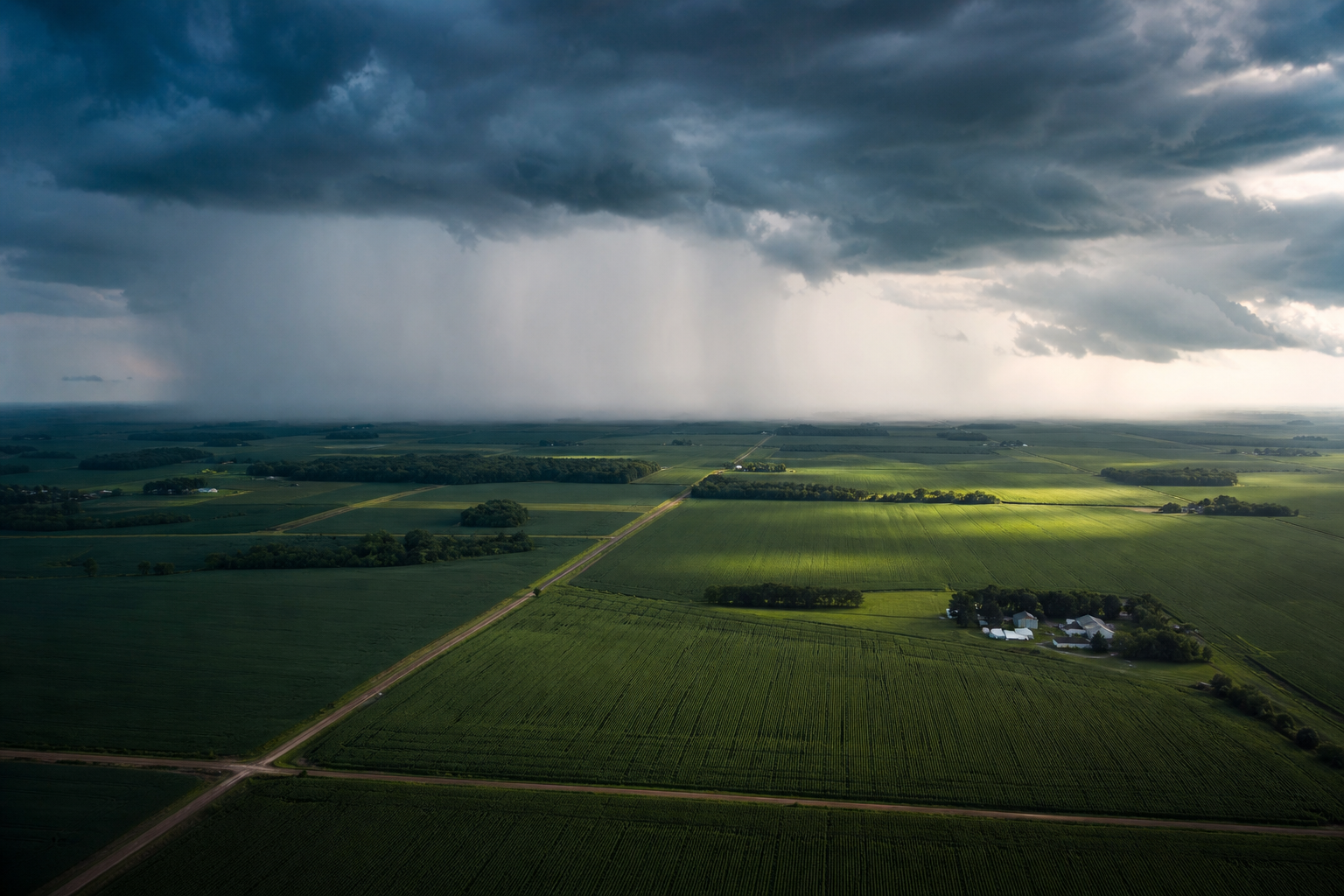

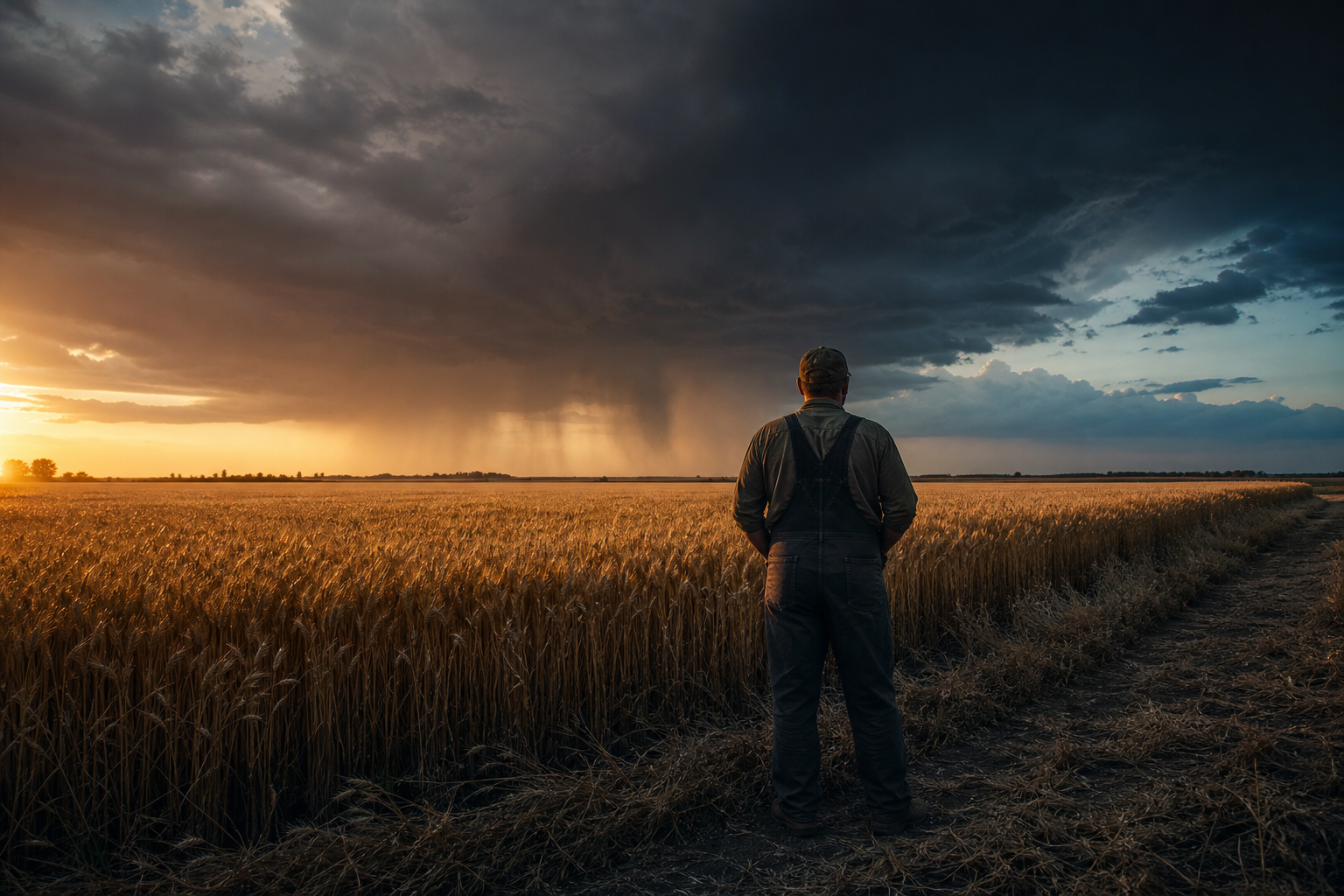
- Weather is the subject. Rain, storm fronts, wet soil, and the sky doing something not generic farm stock.
- Show the stakes. Fields, job sites, turf — the places where an inch of rain changes the day. People appear in their environment, candidly.
- Grade cool and honest. Deep blues, true greens, moody skies. No oversaturated HDR, no orange-teal Instagram filters.
- Scale tells the story: pair wide aerials with ground-level details (droplets, soil, leaves) for contrast.
Voice & writing about data
Precip sounds confident, plainspoken, and a little obsessive about precision. We talk about real measurements, not vibes: prefer "1.2 inches of rain fell at your field" over "it rained a lot." Avoid hype, jargon, and exclamation points doing the work that data should.
When you quote or describe Precip data, precision is part of the brand:
- Precipitation amounts
- Always pair a number with its unit and time window: “1.2 in of rain in the last 24 hours.” A total without a window is meaningless.
- Units
- Inches to one or two decimals (0.25 in), millimeters as whole numbers (6 mm). Spell out the unit on first use in prose; abbreviate in UI and charts.
- “Observed” vs. “forecast”
- Precip totals are AI-modeled observations of what fell, not forecasts. Never describe past totals as predictions, and never describe forecasts as measurements.
- “Hyperlocal”
- Means field-level, point-specific data — not “nearby station.” Only use it when referring to data for an exact location.
- Accuracy claims
- Don’t invent accuracy statistics. Quote only figures published by Precip, with their context intact.
- Locations
- Name the place the data describes: a farm name, field, town, or county. Avoid vague attributions like “the area.”
Questions?
If you're unsure whether a usage is okay, or you need a format that isn't here (EPS, large-format, co-branded lockups), get in touch before publishing.