
Why soil maps matter
At Precip we obsess over rainfall and soil moisture. Determining the current soil moisture depends on accurate soil maps
Below is a quick primer that covers:
- How SSURGO soil maps were built—long before GIS existed
- What the Web Soil Survey (WSS) portal does well—and where it feels 1990s
- The alternative 30m POLARIS dataset for modern hydrologic work
SSURGO: a boots‑on‑the‑ground mapping legacy
Long before GPS or lidar, soil scientists fanned out across every U.S. county with shovels, augers, and aerial photos in hand. The SSURGO soils dataset represents over a century of meticulous, mapping conducted by soil scientists across the United States. Beginning in the early 1900s, teams equipped with shovels, soil augers, and aerial photographs systematically traversed landscapes to document soil characteristics. At each location, scientists dug pits or took auger samples, carefully noting the distinct soil horizons, textures, colors, drainage patterns, and evidence of seasonal saturation.
These detailed field observations were later supported by laboratory analyses of representative soil samples, determining attributes such as particle size distribution, organic matter content, bulk density, pH, and hydraulic conductivity- all of which are essential for soil moisture modeling. Using this combined field and laboratory data, soil scientists categorized similar soils into named series, which were then grouped into practical map units reflecting typical landforms and slopes, such as “Miami loam, 2–6% slopes.”
Initially recorded on paper maps using aerial photos as base layers, these delineations were carefully verified and refined through repeated field visits before being officially published as county soil surveys. Starting in the latter half of the 20th century, the paper maps were digitized, transforming SSURGO into the comprehensive, GIS dataset available today through the USDA’s Web Soil Survey.
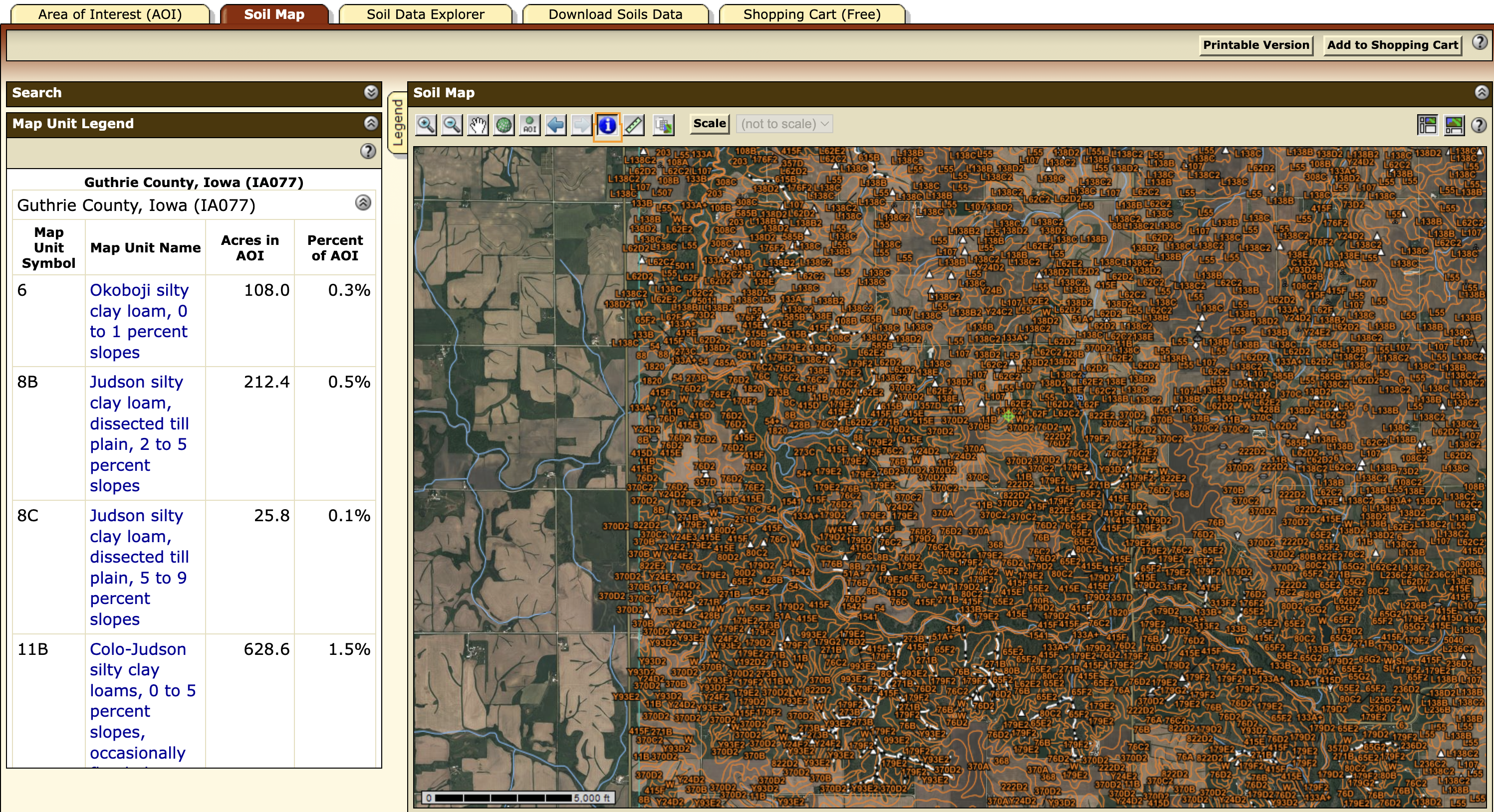
How most people access soil maps using the Web Soil Survey
The Web Soil Survey is the free USDA portal that lets you:
- Draw an Area of Interest (AOI)
- Preview the soil polygons and click on them for attributes
- Export a geodatabase / shapefile bundle or a multi‑tab CSV
It is a popular, but sometimes frustraiting to use tool that gives anyone access to the data contained in the SSURGO dataset.
Why WSS can be clunky
| Pain point | Impact on workflows |
|---|---|
| Old-School UI | Complicated user interface has a steep leaning curve |
| Hand‑drawn AOI | Large areas require multiple clicks & downloads |
| Variable polygon size | Sub‑field variability gets averaged out |
| No official API | Hard to automate in cloud pipelines |
| Attribute sprawl | Joining 50+ SSURGO tables is a rite of passage |
POLARIS: high resolution, spatially consistent soil data in Precip
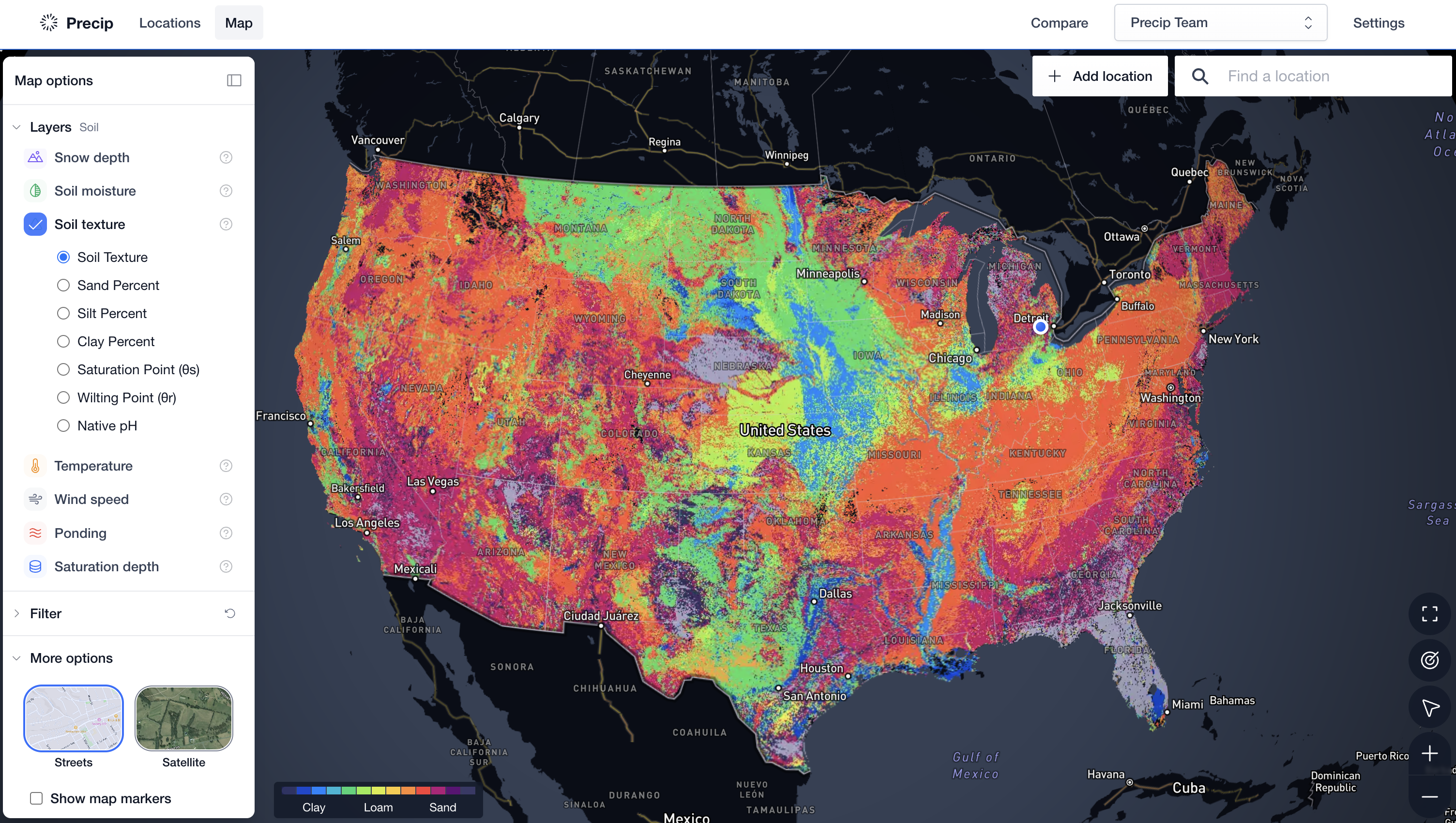
The POLARIS dataset (Probabilistic Remapping of SSURGO) downscales the coarse SSURGO polygons to 30m raster pixels using machine‑learning models fed by Landsat, terrain, and climate covariates.
For every pixel you get mean, median, and percentiles for:
- Texture fractions (Sand, Silt, Clay)
- Bulk density, ph, organic carbon
- Saturated hydraulic conductivity (K‑sat)
- Full water‑retention curves (θsat, α, n)
Why we love POLARIS
- Finer resolution (30 m pixels) captures sub-field variability that SSURGO’s broad polygons smooth over.
- Ready-made hydraulic parameters (θsat, Ks, α, n) arrive as rasters, so models can ingest the data directly.
- Pixel-level uncertainty bands provide percentiles for each property.
Key takeaway
It is pretty remarkable that a dataset like SSURGO exists, but accessing it can be a bit clunky. Precip makes it easy to see soil texture and hydraulic parameters from POLARIS so you don’t have to hunt thought SSURGO layers.