
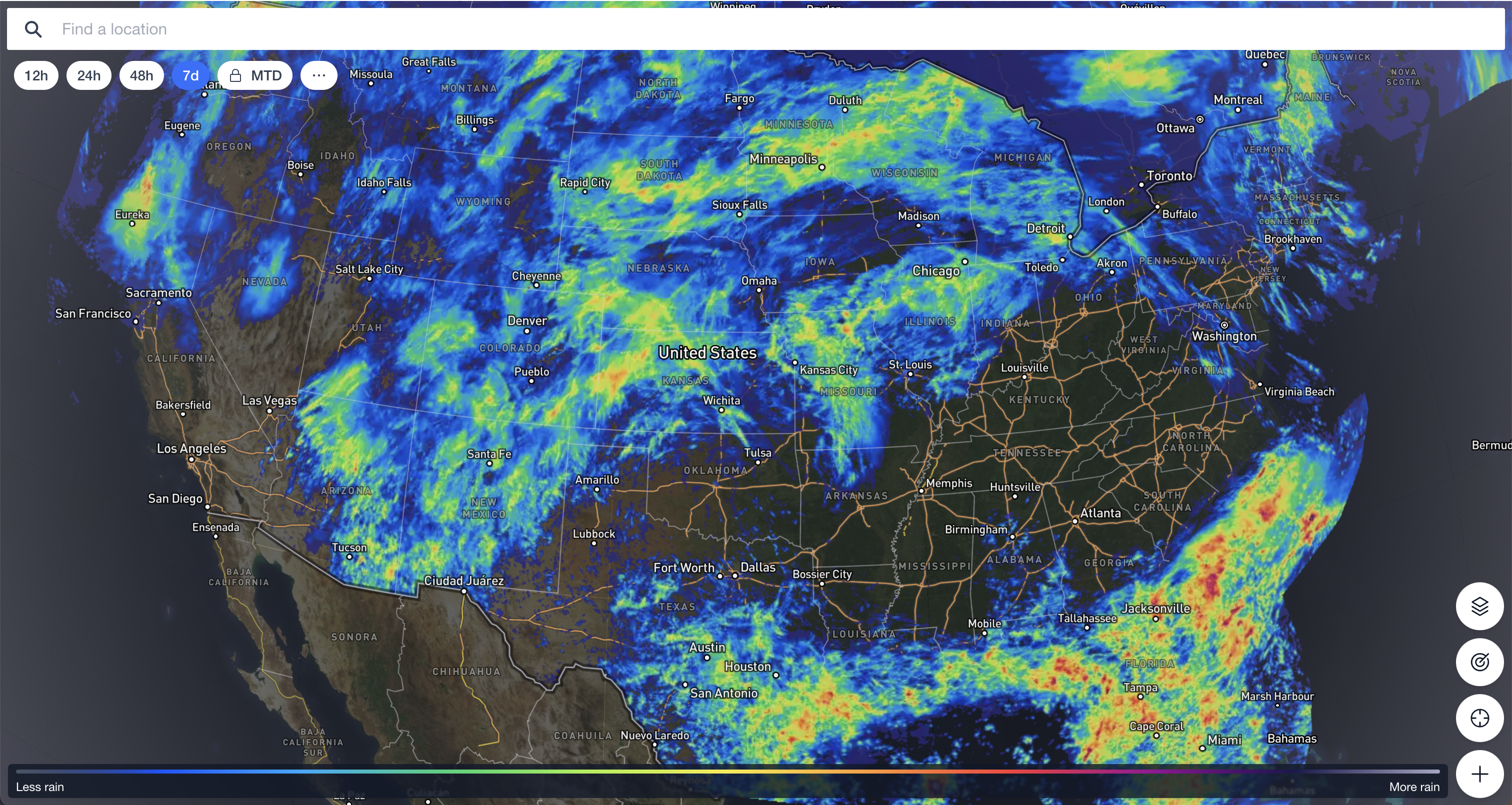
1 - Transparent rainfall map layer
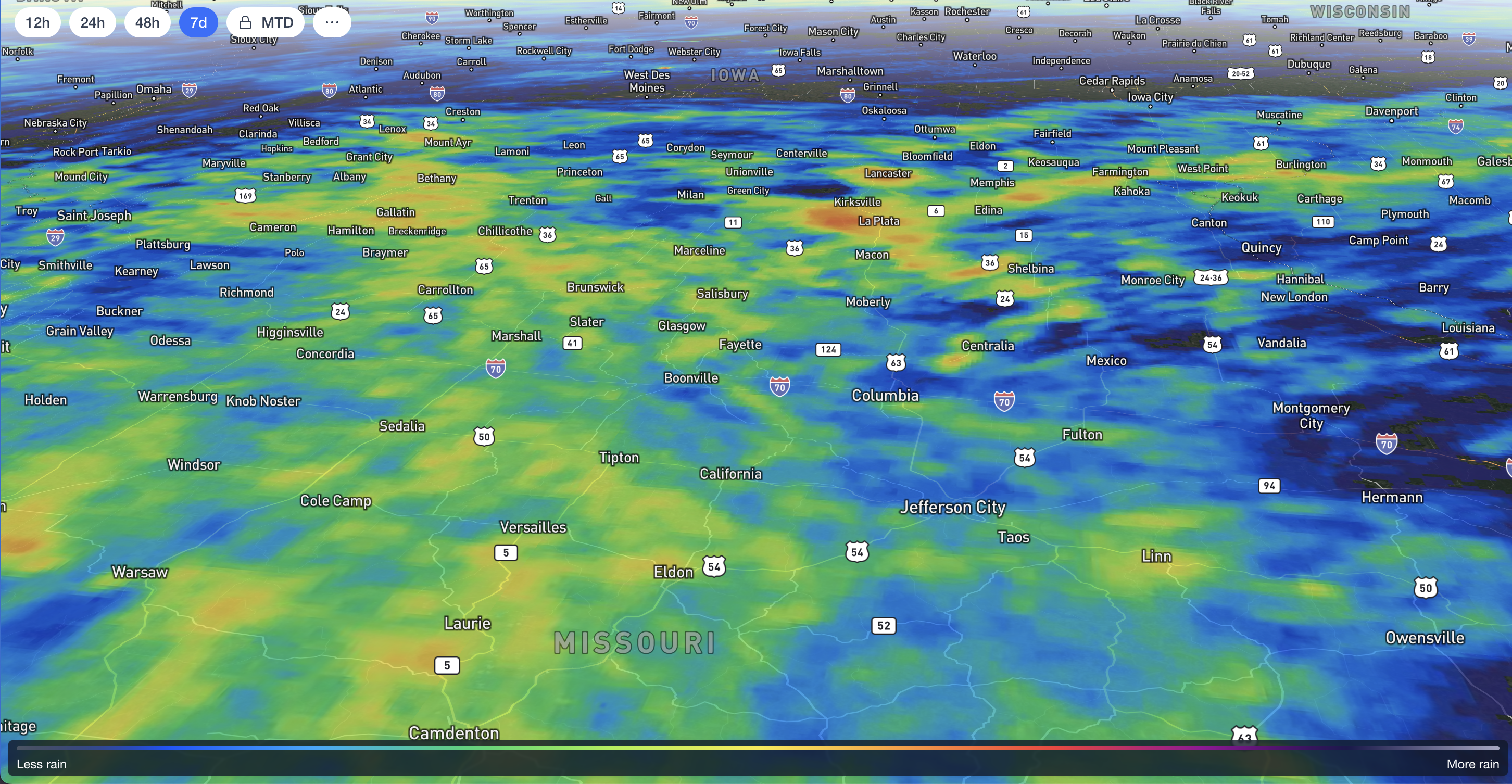
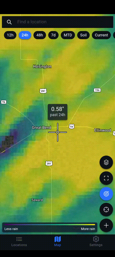
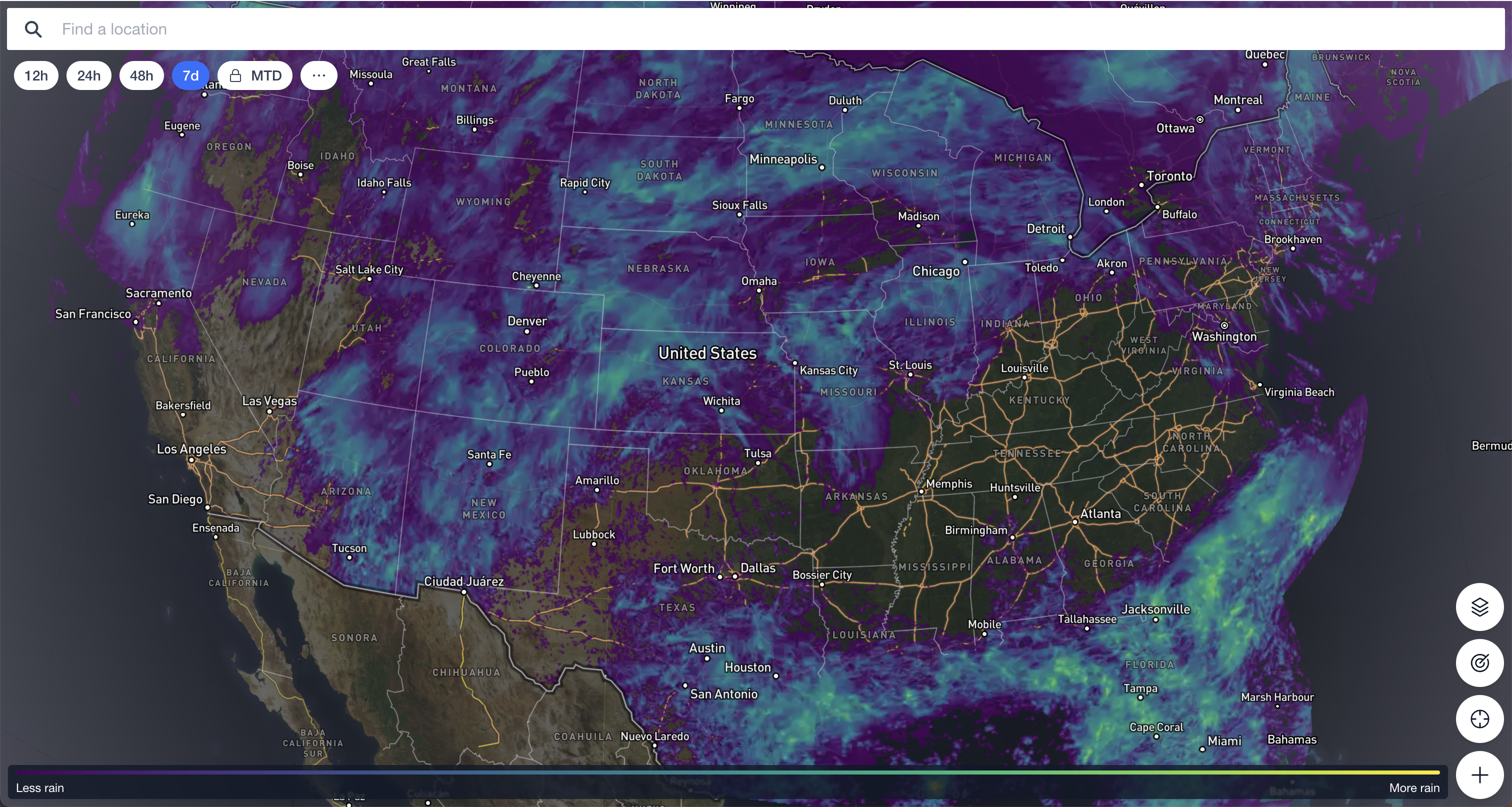
The first thing we wanted to tackle was addressing the feedback that when we show the 12, 24, and 48 hour rainfall totals on the map, it covers up the imagery below. Seeing the rainfall estimate for an area is now much easier with some tweaks to the way we render the map at different zoom levels. City and road names now show above the precipitation data so you can always see them. We also made the rainfall estimate layer slightly transparent so you can see everything below it. It starts out just slightly transparent and then becomes more transparent as you zoom in.
2 - Fine tuned color stops
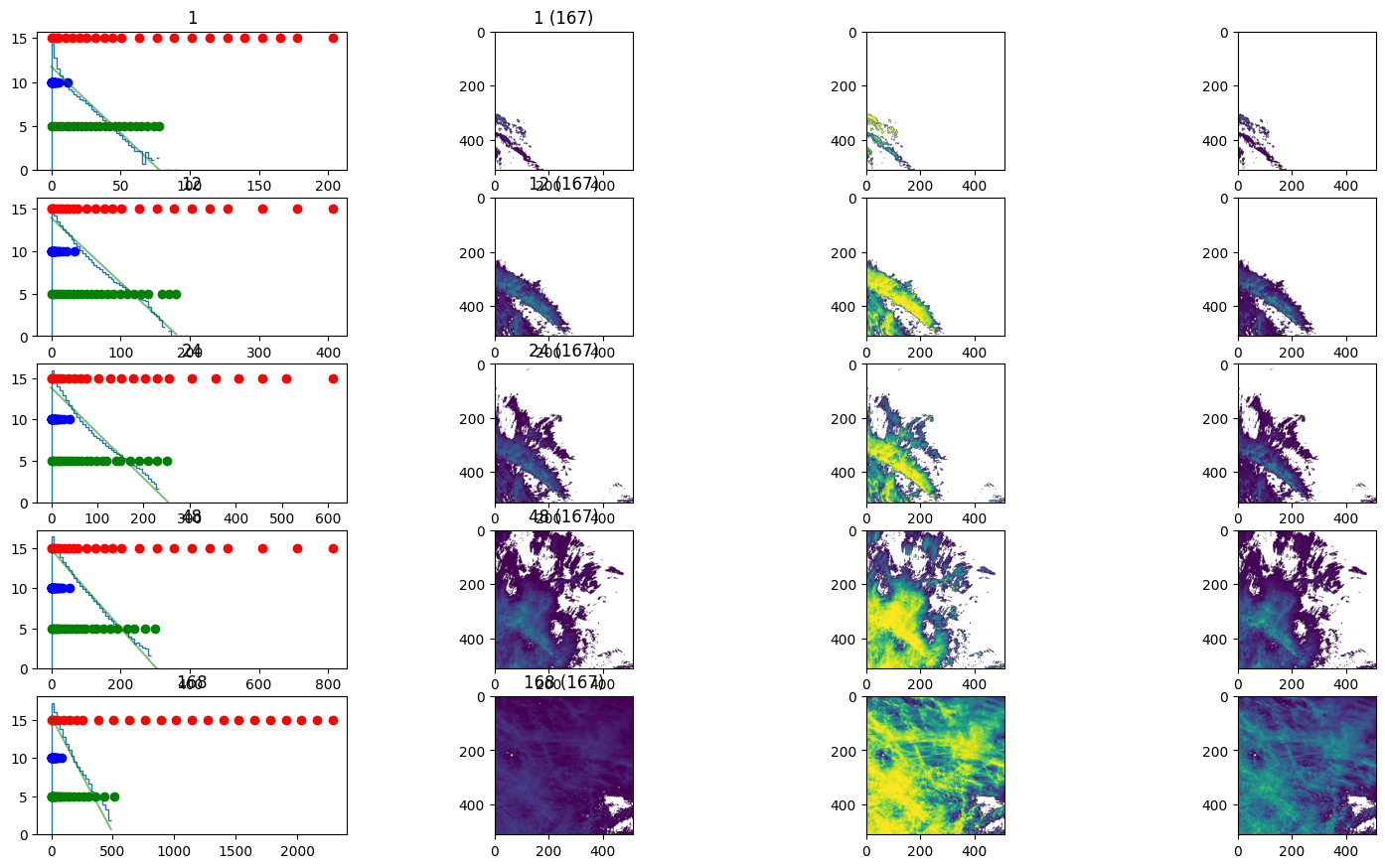
As we added more rainfall data to the map, it became clear that longer time accumulations need the colors spread out differently than shorter time periods. This is because what we think of as a lot of rain over twelve hours isn’t the same as what we think is a lot of rain over longer time periods like seven days. Our improvements make it easier to see the variation in rain on all the layers we offer without the larger values all just saturating to the same color. Being a data-driven team, our CTO Michael conducted a statistical analysis of rainfall data over an entire year to calculate the optimal stops on the color ramp for each layer we offer. We then compared them to maps generated by the national weather service as another point of comparison.
3 - Enhanced color scale
The final change to making better rainfall map layers was designing a new custom color scale. While tuning the color stops for the old “veridis” color scale certainly made an improvement, we noticed it was still hard to see a lot of detail with only three main colors. Our goal was to make a new color scale that showed as much of the variability as possible in a way that felt intuitive and easy to interpret even without a legend. Designing a map that can show precipitation data as clearly for a hurricane as for everyday showers wasn’t easy, but we think we got pretty close!
A final note from the team
We had a lot of fun making these improvements and hope they help our regular users better understand the rainfall estimate for the locations they care about in our map view. Other maps like the ones from the National Oceanic and Atmospheric Administration (NOAA) web page don’t have these nuanced details that make our app the best source for rainfall totals. Thank you to everyone who provided feedback that inspired these changes.