
Digging deep into precipitation patterns in Precip
Precip isn’t just for getting 24-hour rainfall totals or browsing rainfall on the map. Saving locations and upgrading to a paid plan unlocks deep insights and understanding of precipitation patterns at your locations over the years.
In this post we’ll walk through how to dig deeper using the Cumulative and Non-Cumulative precipitation charts on the Location detail page in the Precip app.
The cumulative precipitation chart
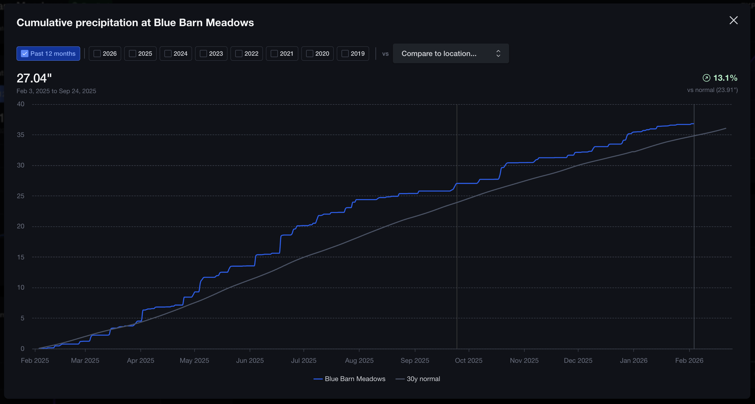
The cumulative precipitation chart answers “how much has accumulated from the start of the year to each day, compared to normal.” It is a great way to study seasonal accumulation.
By default the chart shows the rolling past 12 months and a scrubber lets you move through the year day by day. Hovering makes it easy to see how much you were ahead or behind for the season at any given point without doing the math yourself.
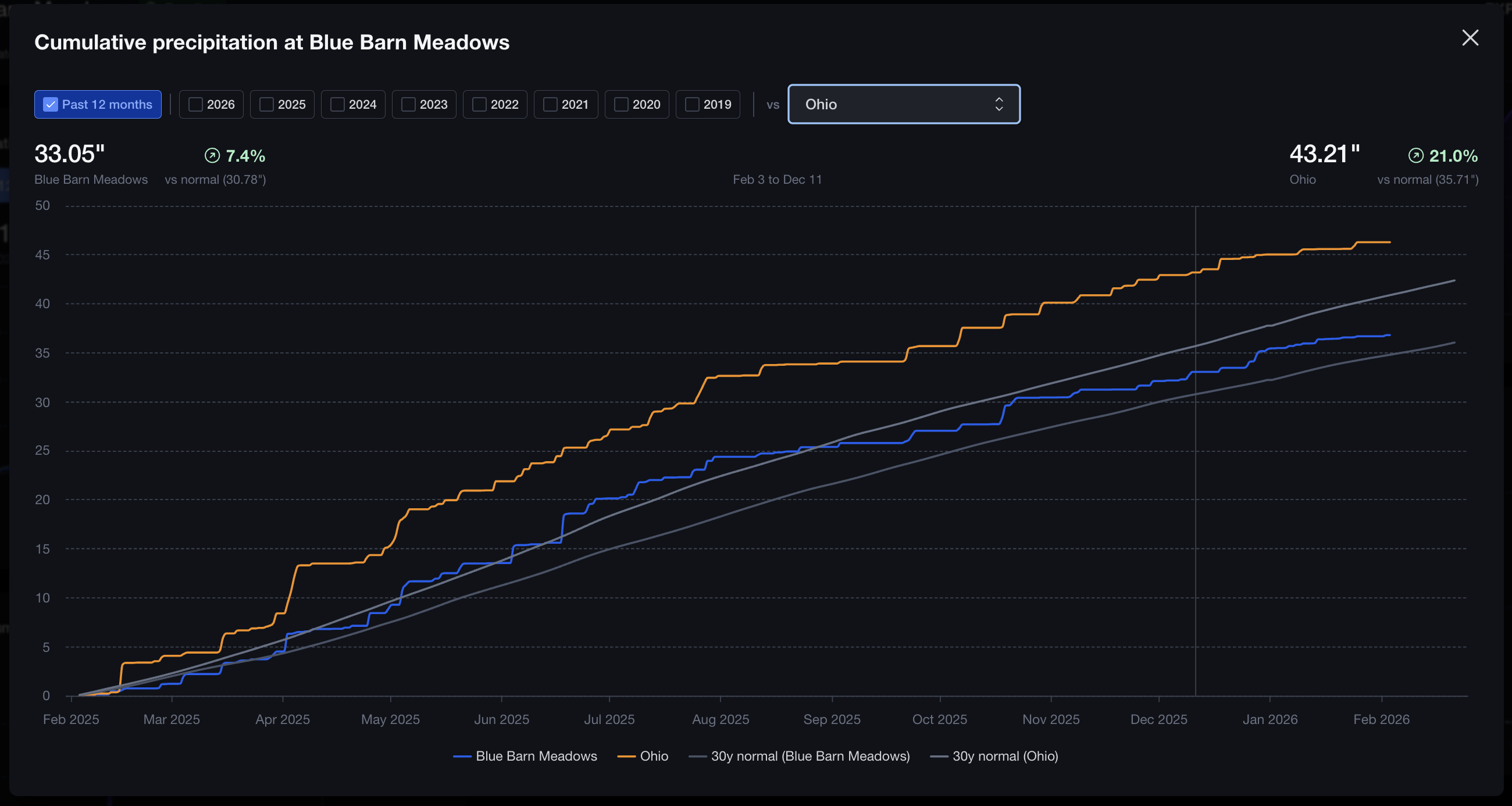
If you have multiple locations, you can also compare one location to another for the same year or for the past 12 months from the same fullscreen view.
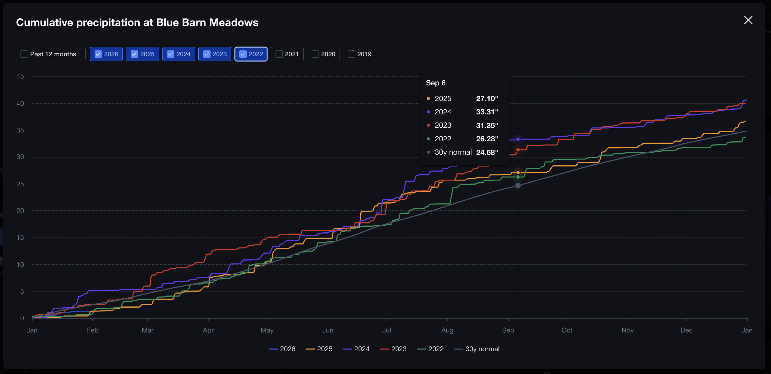
Another option is to select multiple years for comparison to see which years were wetter or drier and when they diverged. Tooltips show cumulative values for each year at the same day-of-year so you can compare up to any given day in the year. You can also click and drag to zoom into any particular date range.
The non-cumulative precipitation chart
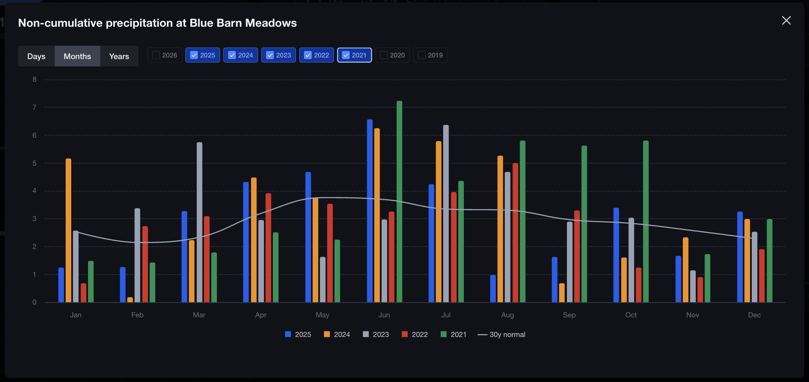
When you want to look at daily, monthly, or yearly rain in bar chart form, the non-cumulative chart is the go-to option. On the Months view you can select multiple years worth of data grouped by month and compared to the 30-year normal.
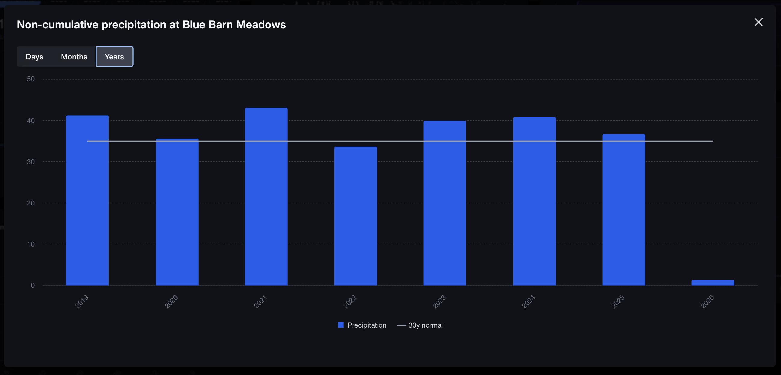
Toggle over to Years and you’ll see the full year-by-year history compared to the 30-year normal.
Summary
- Cumulative chart: Check out season totals vs normal and compare year-to-year or location-to-location
- Non-cumulative chart: See daily, monthly, or yearly precipitation (how much fell in each period).